Module Project: Visual Communication and Design
For our module project, we were tasked with creating four social media graphics based on two different sets of copy. For each graphic, we were meant to consider the information given and “edit and break” as appropriate to allow the viewer to take in the information easily. Additionally, we were instructed to create hierarchy within the text using type contrast and grouping using space, alignment, and repetition.
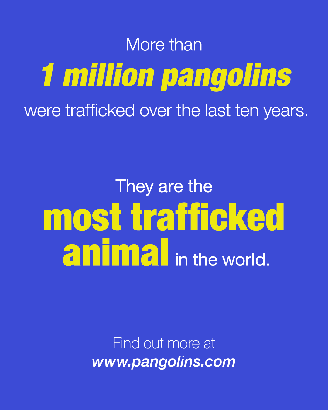
Pangolin Copy: Pangolins are the most trafficked animal in the world. More than 1 million pangolins were trafficked over the last ten-year period. Find out more at www.pangolins.com.
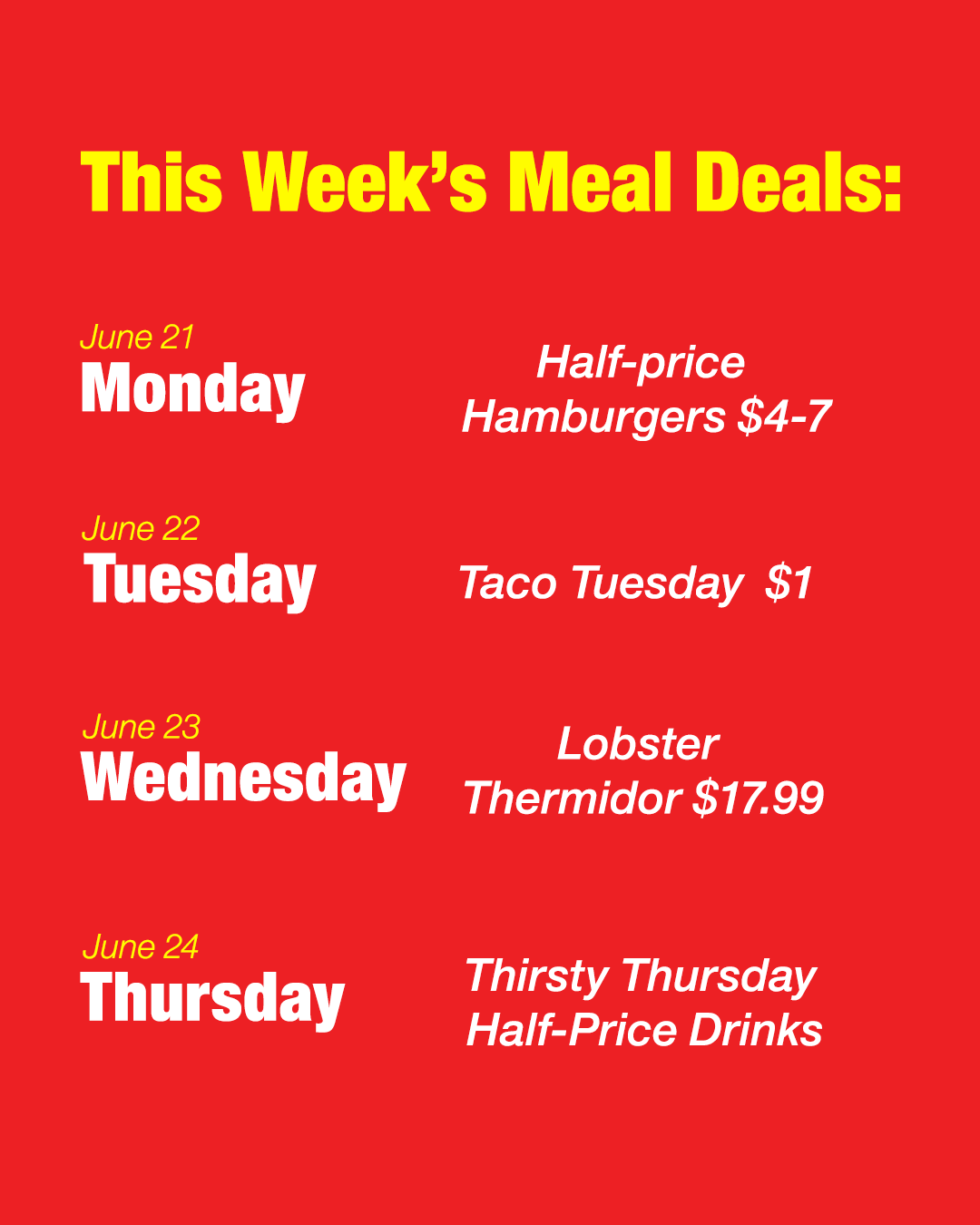
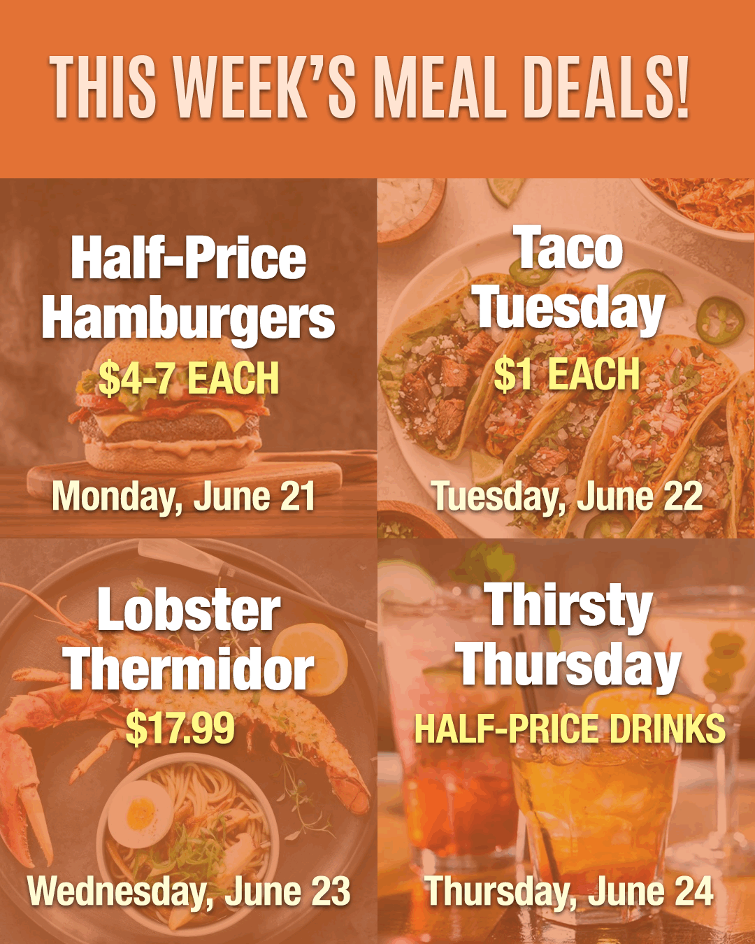
Meal Deal Copy: This week’s meal deals: Half price hamburgers $4-7 each Monday, June 21, Taco Tuesday $1 each Tuesday, June 22, Lobster Thermidor $17.99 Wednesday, June 23, Thirsty Thursday Half price drinks Thursday, June 24

Pangolins (Design 1): Left-aligned text, only in grayscale

Pangolins (Design 2): Color, center, right, or justified alignment

Meal Deals (Design 1): Text only records

Meal Deals (Design 2): Grid with images
Pangolins (Design 1):
For the first graphic, I edited and broke the information into three groups, creating hierarchy and sub-hierarchy within the text. I also punched two key phrases: “1 million pangolins” and “most trafficked animal.” This forces the viewer to pay the most attention to these two pieces of information. There are six type contrasts in this graphic, making it visually compelling to the viewer.
Pangolins (Design 2):
For the second graphic, I edited and broke the information into the same three groups as the first design. Instead of a right alignment, however, I used a center alignment which balanced the graphic well. I punched the same two key phrases as the last graphic and used another type contrast (color) to create even more visual weight. In both pangolin designs, I paid specific attention to text sizing, kerning, and leading as well as readability in order to create visually engaging graphics.
Meal Deals (Design 1):
For the first graphic, I edited and broke the information into a headline and four sub-categories. These include Date, day of the week, meal choice, and price. I used different type contrast for all four sub-categories in order to create hierarchies within the text. I also used color as a type contrast to punch the headline to make it pop and the dates to make them more readable. I paid specific attention to the leading between the days of the week and the dates for readability. I also made sure that all text was aligned to a margin line. There are four type contrasts in this graphic that make it visually compelling.
Meal Deals (Design 1):
For the second graphic, I edited and broke the information the same way, but organized it differently. I used four images to create boxes behind the meal choices that coincided with the text. I also lowered the opacity to allow the text to be more readable and added a drop shadow. By breaking up the information into a 2x2 grid, the list of meal deals for the week is very clear to the viewer. The differences in font color create hierarchies between the information present in the graphic. There are four type contrasts in this graphic that help make it visually engaging.